
my backup plan
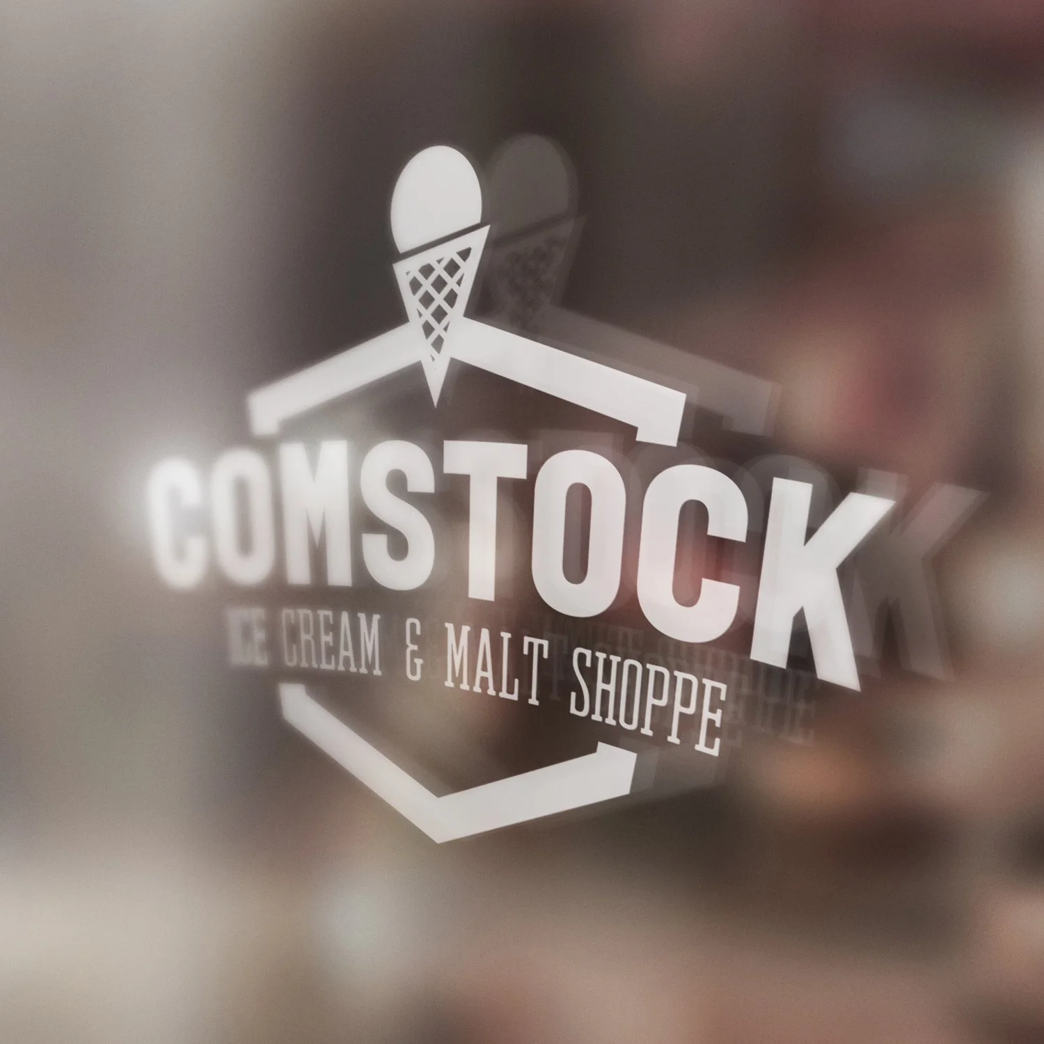
This piece takes inspiration from vintage diner signage and classic malt shop branding, then reimagines it with a sharper, more modern aesthetic. The bold lettering, shield frame, and ice cream cone nod to mid-century Americana, while the stripped-down geometry keeps it fresh and contemporary.
The result is a mash-up of eras: a mark that feels like it could be stamped on a weathered sign outside a 1950s ice cream parlor, but just as easily hold its own on slick modern packaging.

